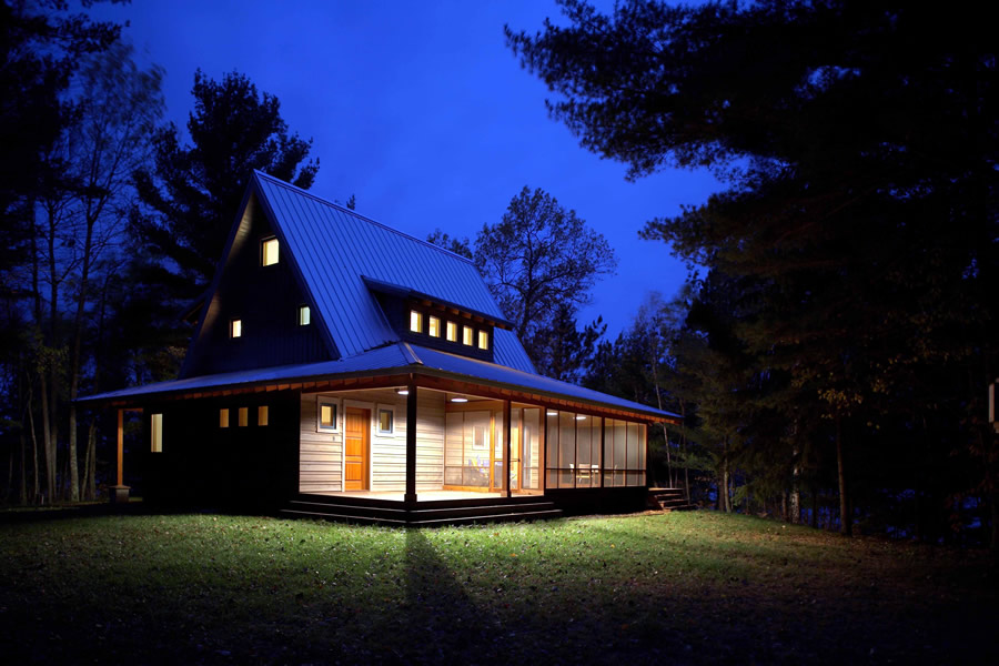
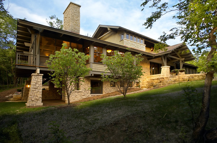
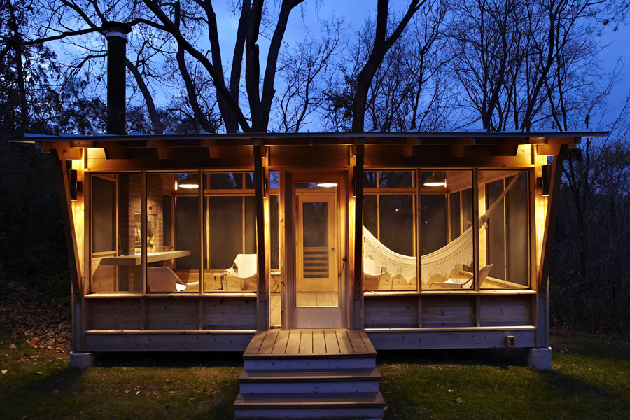
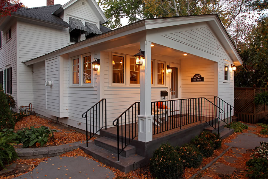
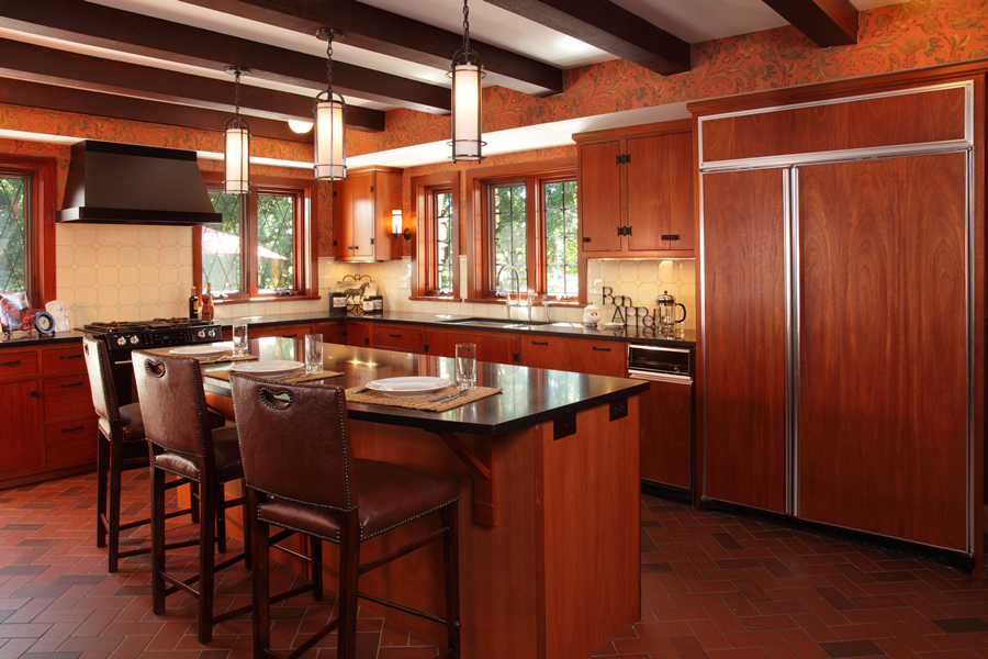
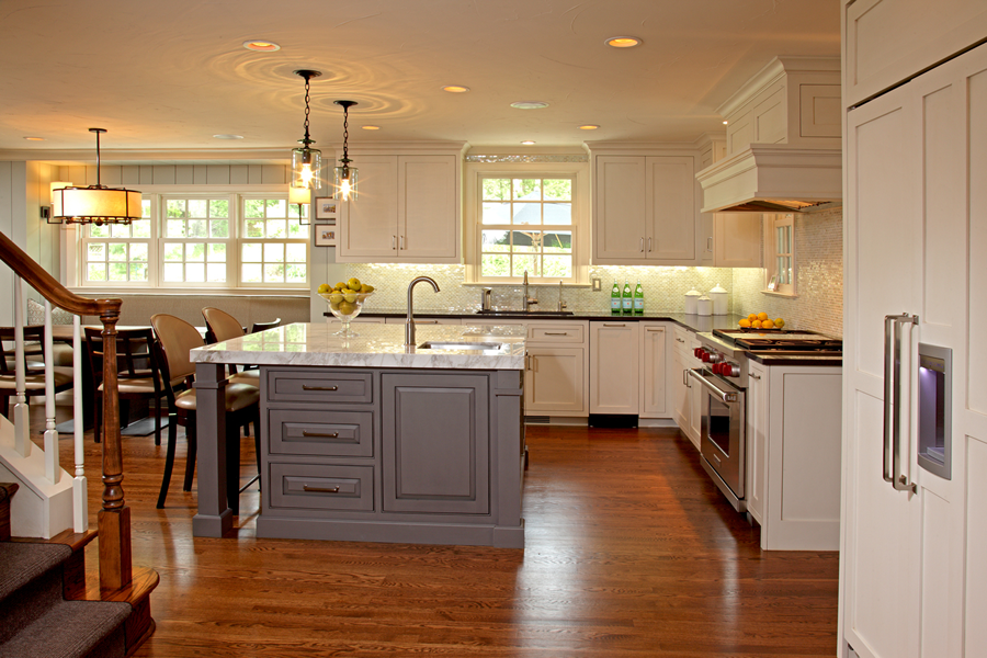
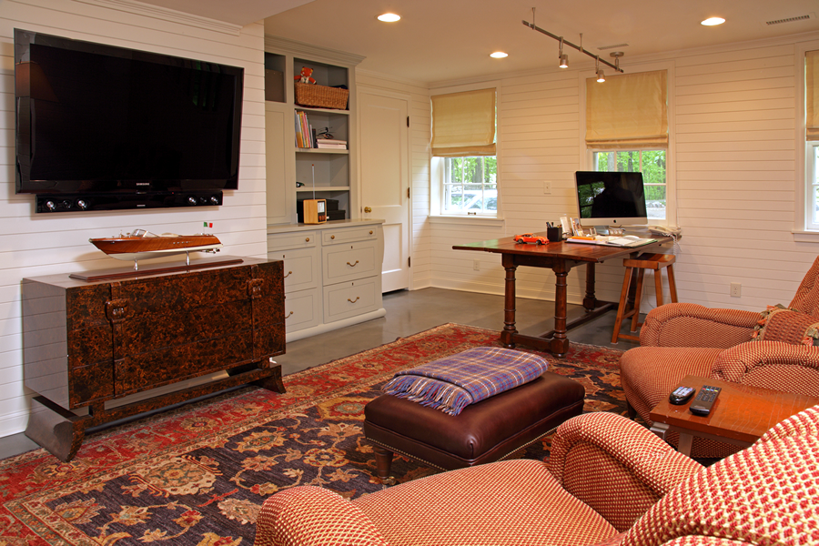
The "A" frame with a low "skirt" roof is a response to the owner's desire for a compact cabin in close contact with nature in a clearing in the woods on Gull Lake, WI. The 1,700 square feet structure fits a family of four in summer and in winter, including pets and guests.
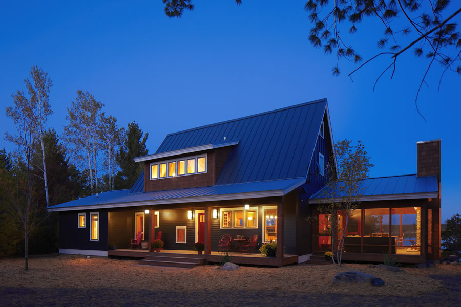
Located on a ridge in a forest in Boone, IA, this house was inspired by a kid's teeter-totter. The middle of the house sits on the top of the ridge and the two ends project out into nature as when the teeter-totter is in balance. These two ends are a private and a social screen porch sitting high above the ground. Both overlook the forest as it slopes down to the Des Moines River in Ledges Park. This house was published in the book "House in the Landscape: Siting your Home Naturally" by Jeremiah Eck, Princeton University Press.
See
walk-through animation
This shed was commissioned by the Family Handyman magazine and was featured in their July 2007 edition. The client wanted a well-designed and carefully detailed suburban backyard shed that could be constructed by an amateur builder using off-the-shelf materials. In order to reach a broad audience the budget was kept to a minimum. All the details were developed focusing on simple, easy to communicate fabrication tasks. Materials were used in their original dimensions to avoid extra cuts. The shed won a RAVE award in 2007 and was published in the Minneapolis St. Paul magazine.
When their daughters grew out of the swing set the family decided to replace it with a Pavilion for summer use. The Pavilion has a "parrilla" to grill beef and chorizos following the Argentinian and Uruguayan tradition.
RAVE 2012 Winner: Prairie Pampa Pavilion
RAVE Award 'Meet the Architect' video by Minneapolis St. Paul Magazine
See walk-through animation
The cabin is also an example of a successful collaboration between architect and interior designers. Fiddlehead design played an active role from the beginning of the project, which allowed for a seamless transition between the architecture and furnishing stages.
See
walk-through animation
Check http://fiddleheaddesigngroup.com
for more information.
Located in St. Paul's Historic Hill District, this house was in need of a kitchen and basement update like many other century old homes in the neighborhood. The small addition to the kitchen created a "U" shaped cooking space with views to the backyard, and the limestone foundation walls were retrofitted with proper ventilation and insulation to create an open basement space.
The owners transformed this small bungalow in stages, concluding with the kitchen and the front of the house. It won a BLEND award in 2011 and was featured in a METRO magazine article on Best Minneapolis neighborhoods.
The three season porch of this home had a great view of White Bear Lake so the owners decided to transform it into a year round space. By extending four feet outwards the new porch with big windows looking at the lake became the new heart of the home.
After many remodels to update their home, the owners decided to redesign the front elevation, which was the only piece left untouched in their previous projects. We added an open porch along with a small sitting space on the front and extended the gable dormer on top of the entry. An exterior stair and wood railing was added to connect the entry to the driveway. This is a good example of a project that had a small budget and yet transformed significantly the curb appeal and the entry experience of this home.
When looking to remodel early 20th century homes we sometimes find that the main design challenge lies not in the original building but instead in the additions that have been done to the house later. This home is a good example of this kind of remodel. Built in the early 1900s, it went through an extensive addition in the 1980s that increased its square footage without paying too much attention to its character. The owner, an enthusiast of Mexican art and culture, welcomed the proposal of an enclosed patio as a way to connect the isolated rooms from the previous remodel, as well as a new front porch to make the house more welcoming and to increase its curb appeal.
The owners bought this rambler in Circle Pines with a remodel in mind that kept the unique modern look of the house. A bump out was added for a dining/family room space and the unfinished basement became a playroom and music room for the whole family.
To the owners this spacious suburban home felt disconnected for it had too many separate rooms and no adequate gathering space for the family. In other words the house had too many rooms and no heart. A more inviting family space was created by joining two rooms and by adding a TV, a fireplace and built-in bookcases. As it happens in many homes today, the TV and the fireplace share the center of the family room. In this case the fireplace was located at the bottom of the wall and the flat screen TV was built into the bookcases above it. To avoid the conflicts generated by these two sharing the family's attention, a pair of sliding doors was added to the bookcase that hides the TV when needed.
Years after adding a porch to their house (also see Lake View Porch) the owners decided to remodel the kitchen. The existing back wall was extended six feet outwards and a new open porch was added in the same direction. The back part of the home now has a kitchen with a bigger pantry, a new island and cabinets, plus a new laundry room and mudroom. For the owners that like to spend time in the kitchen the new spaces added a second heart to the home.
See
walk-through animation
This remodel is a good example of the change in perception there has been about ramblers in recent years. Instead of knocking them down or doing a complete style make over, more and more people have started to appreciate the efficient plan layouts and simple aesthetics of ramblers. The owner in this case wanted to update the kitchen and integrate it to the rest of the house, along with an entry foyer, all in keeping with its original charm.
Traditionally, historic homes go through a series of bad remodels. However, this one was a time capsule that hadn't gone through those "terrible teenage years." The current owners were the perfect couple to move into this house and shine it up, nip n tuck where required and breathe new life into it. The kitchen was completely gutted and expanded, a new office was tucked into the attic and new ceilings, beams, crown molding and cabinets were added throughout the house. Documenting existing details, cabinetry design, wood species and hardware was critical in knitting the home to its past. By reusing the existing language and plugging in new Tudor details, where required, allows the new space to feel effortless, cohesive and a bit more refined.
This 1939 Cape Cod Kitchen remodel solved a lot of the problems an old house inherits. The kitchen was closed off both visually and physically to the surrounding spaces. It lacked good efficient storage and the ability to function both intimately when it is just the family of four or absorb a large group for a party without feeling too big or too small. It also needed to address the closed off staircase that felt like an afterthought. By opening up the walls and staircase it allowed circulation to navigate thru the kitchen. Activating the space and allowing the Kitchen to position itself as the true center of the home. While taking its nod from the existing unique architectural details and retaining as much of the existing architectural character and charm. The new kitchen feels new and old at the same time. While all of its problems were solved, it doesn't feel like an obvious remodel. It flows effortlessly into the other spaces, visually, physically and architecturally.
This 1930's Cottage had plenty of existing square footage. It needed quality of space over quantity of space. Since both clients work out of their home they were desperate for an efficient office. Taking the existing basement down to its bare bones allowed the homeowners to start with a clean slate. Nodding to its 1930's roots reclaimed wood of the same age was incorporated into the staircase and mud room bench. By using these materials, the staircase and bench felt more authentic to the house. Painted wood walls were added with a decidedly modern twist by running the boards horizontally.